Sound The Alarm
We partnered with TeamTRI to create an edgy, intense identity that transformed into animated graphics and a complete stage set!
Inspired by an industrial atmosphere of heavy machinery, this year’s identity will alert everyone that Georgia FCCLA is on its way to the top. It may even hurt their ears! Members will feel enthralled to push through whatever hardships may fall their way and emerge a winner.
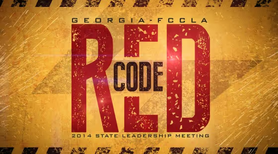
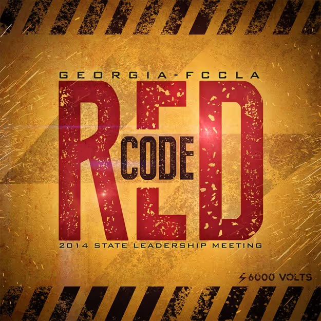
The logo was inspired by modern-day warning signs. Warnings and alerts are typically bold and easy to read in a hurry. We followed the same approach here. The word “code” is small, yet it draws your eye toward the center, thus allowing you to experience the alarming size of the word “RED.” Its simplicity delivers an urgent message.
Everything in this identity has a worn, rough treatment. The rugged look in this logo symbolizes the hardships that one must go through to accomplish greatness. Striped lines run across the top and bottom as a sign of caution. The symbol for high voltage rests behind the logo as sparks ignite from both sides, electrifying FCCLA’s Leadership.
.png)


