Leader of the Pack
Annual branding for the nation’s top organization preparing future health professionals.
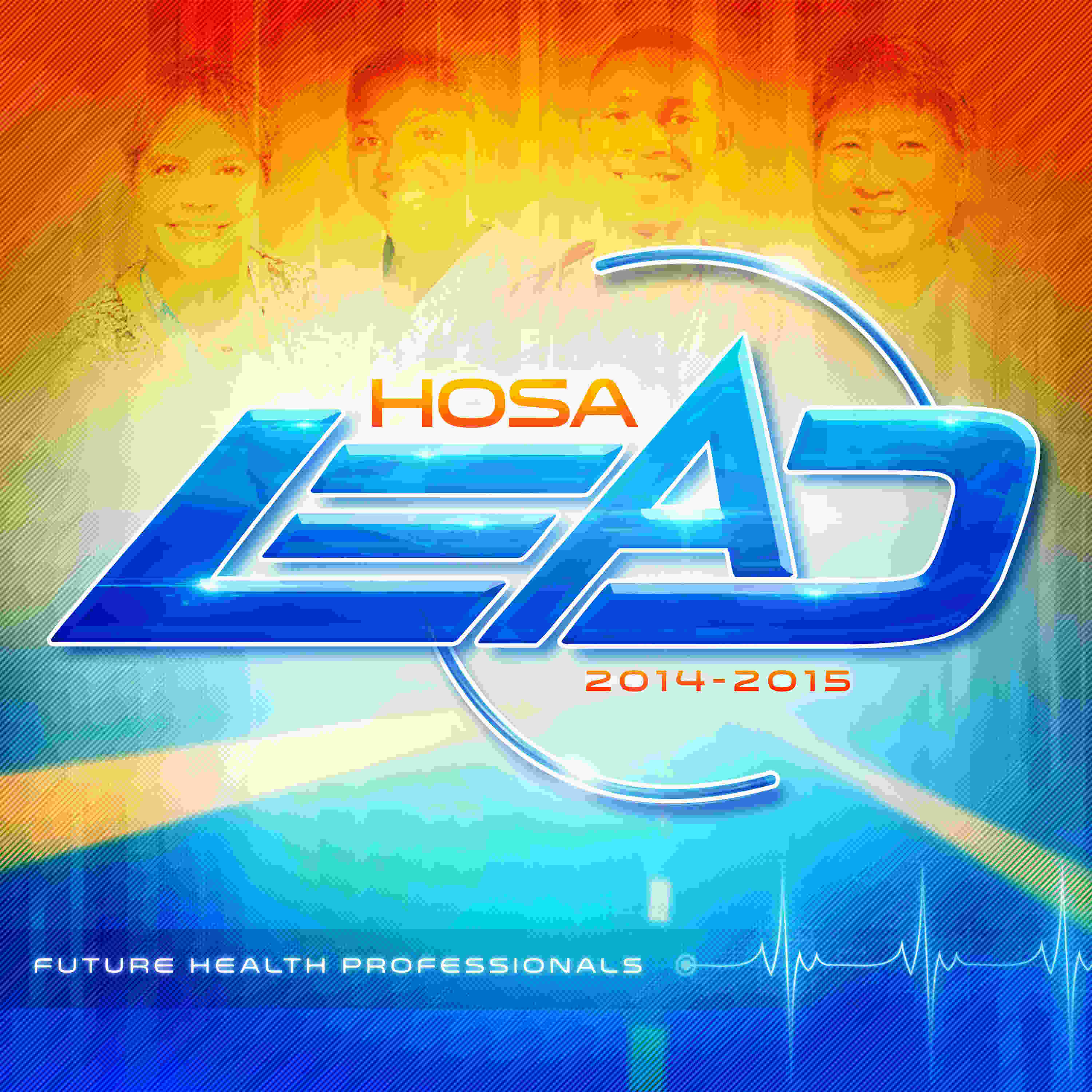
Step up to every challenge that comes your way with the 2014-2015 HOSA identity “LEAD”. We were instantly inspired by the strength and boldness of the word “lead”. HOSA members exuberate these qualities and we capture that in this logo.
This logo is vibrant, fresh, and full of movement. The vibrant blue represents knowledge, power, and integrity, and a rich crystal shines within, as though it were a treasured talisman. Finally, we support the brand with two circular rings orbiting a triangular “A” to tie back into the HOSA identity.
If the logo was not vibrant enough, we definitely didn’t hold back with the atmosphere surrounding it. We drew upon vivid blues, reds, and yellows to supercharge the background. The EKG anchors our identity, reminding us that HOSA is alive and making a difference. An overlay of street lines zoom towards the logo representing our forward future. And finally, it is the faces of real HOSA students who complete the identity, who will lead the next generation of health workers in the years ahead.
So become the Future Health Professional you were meant to be, and let this identity help you LEAD HOSA into the future
.png)


